
Find the March 2014 newsletter here.
]]>
In January, Noreen spoke at the Creative Network sold out event, Let’s Talk, in Belgium.
In January, Sean also judged the 2013 Austin ADDY’s Awards with Anne Telford and Tim Guy.
In November, 2012, Sean Adams and Noreen Morioka were keynote speakers at the RGD Design Thinkers National conference in Toronto. At the conclusion of the conference, both Sean and Noreen served as emcees for the Adobe Design Achievement Awards which celebrates 16 young designers and design faculty.
Whenever we complain that the biggest issue is the size of Garamond, or why does the client insist we use their corporate blue, the whole profession becomes about something small. –Sean Adams
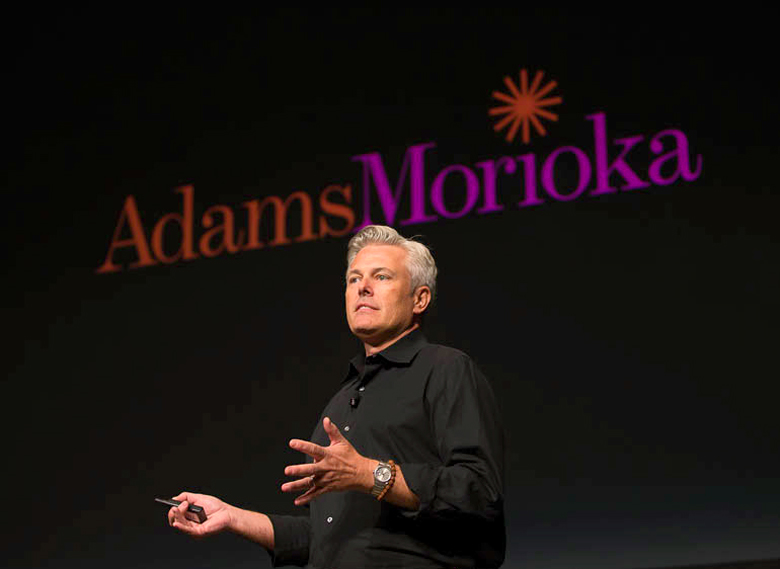
Sean Adams is a partner with Noreen Morioka at AdamsMorioka in Beverly Hills, CA. He has been recognized by every major competition and publication. A solo exhibition on AdamsMorioka was held at The San Francisco Museum of Modern Art, and Adams has been cited as one of the forty most important people shaping design internationally in the ID40AdamsMorioka’s clients include The Academy of Motion Picture Arts and Sciences, Adobe, Gap, Frank Gehry Partners, Nickelodeon, Sundance, Target, USC, and The Walt Disney Company.
Fifteen years ago I was so clear in my direction and goal to clean up the world, and finding inspiration was so easy. Maybe it’s because I’m older, or busier, or jaded, but finding inspiration is more difficult for me now. Finding a wonderful booklet at a used bookstore, or discovering a graphic novel in a Japanese department store was endlessly exciting. Today the process is less about seeing and more about learning. Reading about history, specifically sociological history is inspiring to me now. How did humans relate to one another in 17th century Virginia, or what political issues informed the cold war, or how did photography impact the Civil War? These discoveries don’t lend themselves to the kind of inspiration that is about seeing, but they move me to reconsider why I do something. But I am a visual person, and still love finding that odd magazine cover from 1967, or riding through It’s a Small World, or discovering the color palette from Bye Bye Birdie.
Like most designers, I endlessly sketch in my notebook, and have hundreds of historical images in my iPhoto file. All that input seems to get mixed up in my head and comes out when I don’t expect it. It’s usually a few months after we’ve completed a project that I’ll run across something and say, “That’s where the color palette came from.” I rarely look at my notebooks, but the process of drawing something burns it into my brain.
I would love to say I’m an avid user of design magazines and annuals. But I’m not. I’m happy to read an article, but I don’t thumb through them looking for ideas. In the interest of full disclosure, I will admit I spend time looking at our collection of Graphis Annuals from 1953-1970. I’m not looking at them to copy a poster or book cover. I’m more interested in the way designers during that time utilized symbol and metaphor. It’s a good prompter to start thinking. For example, I might be working on a piece that needs to talk about “new.” I start a list of words that relate: egg, stork, etc. Then I might come across an image of a gift box for an old ad for Bonwit Teller, so I add gift box to the list. I’m not interested in replicating that Bonwit Teller ad’s look and feel, but I’m willing to let the idea of a gift box represent “new”.
I think about the redefinition of design all the time—and I mean all the time. Whether it’s working on the meaning and definition of this for AIGA, or dealing with the direction of AdamsMorioka with Noreen [Morioka]. It’s clearly a field that is fracturing into many pieces. This is good, because it forces us to be communicators, not merely form-makers. And it’s bad, because without guidance, the profession can lose all power and become a million tiny tribes. But I’m more concerned about design’s standing with the business world. We want to be respected and have a seat at the big table, and we should. We know that design will be the force that pulls all of the pieces together and makes something a success. But, we are our own worst enemy. Whenever we complain that the biggest issue is the size of Garamond, or why does the client insist we use their corporate blue, the whole profession becomes about something small. We need to be immaculate and skilled at our craft, and we also need to think big.
2006 Sundance Film Festival
We’ve worked with the Sundance brand for almost a decade. There are basic issues that drive all of the communication. The Festival is one component that is highly visible. The process begins with us sitting down with Robert Redford and discussing his thoughts. We ask him if there are any big ideas he wants to explore, or any issues he feels are pertinent. For the 2006 Festival, he talked about the idea of storytelling being the basis of all filmmaking. We took that conversation and started sketching.
We were working with the idea of storytelling, which is rather broad. At the time I was reading a book by Graham Hancock, Heaven’s Mirror that among other things, talked about the power and longevity of myths. During our first meeting, I found myself sketching little thumbnails of different myths. I didn’t take them seriously because I thought, “Nobody really wants to hear about the Trojan War after high school.”
We tried many ideas that were all pretty awful. This was the fifth Sundance Film Festival we’ve done and there are only so many ways to say, film and Park City. At one point I thought about hiring a design firm, and then I thought, “wait, I have one of those.”
After presenting several variations and feeling stuck, Bob said, “Don’t worry about me, or what I think. What would you do if I weren’t involved and you didn’t have to worry about what I wanted, or the marketing team, or anyone else?” I immediately thought about my little sketches of myths. Fortuitously, I was looking through Saul Bass’ title work for my class at Art Center and I came across his work for Around the World in 80 Days. There was something wonderful about this sequence that used illustration and engravings.
Mexico Restaurante y Barre
Larry Nicola is one of the foremost chefs and restaurateurs in the United States. We had worked with Larry for over 15 years on several of his restaurants. When he asked us to work on his next restaurant, Mexico, I expected it to follow the idea of Larry’s other restaurants that have needed a high-end and high quality attitude. In our first meeting, Larry said he wanted Mexico to feel like a vacation, and be fun and energetic.
The keyword that Larry used was low-tech. This was the starting point. As designers, we are committed to perfection. The printing must be the highest quality, the typography must be flawless, and the forms should be precise. Now, typically, the inspiration point for this project should have been a visit to Tijuana, but this wasn’t the case. I was cleaning out a drawer at my grandparents’ house and found the operations manual for their Whirlpool dryer, circa 1970. The headline type was a remarkably ugly version of Modern No. 20 with added swashes. “Could we make the ugliest typeface ever?” I asked.
When I returned to the office after finding the Whirlpool manual, we started drawing Hobo Italic Swash. This seemed like the perfect font for Mexico. We determined then to use only low-tech materials. The forms and icons are all hand-painted, the typography is courier from the typewriter, the hand-drawn Hobo Italic Swash, and the production techniques are the least expensive possible. [end caption]
Early versions were abandoned for being too precise. Each step was augmented by one of the designers’ find of a low cost solution.
Menus are typically costly and custom. Our creative director, Monica Schlaug, found an off-the-shelf vinyl menu and convinced the manufacturer to make it with turquoise vinyl, which he hadn’t used in decades.
When designing the website, Monica came across a homemade website using a repeat tiled image, so this was applied to Mexico’s site. Chris Taillon, our senior designer, repeatedly repainted the icons to become less perfect, and designed a system of stickers that were printed on rolls at a low-cost sticker company. The goal with each part of the project is to make it feel like someone put their entire heart and soul into the piece, but didn’t really know what they were doing.
Whenever we have abandoned any part of the project, it’s been because the form or design was too well considered. In each instance, we’ve repainted the image, or messed up the composition further. Strangely, it’s hard to untrain yourself from making good composition and subtle color distinctions. Years ago, we worked with David Hockney on several books. Spending time in David’s studio taught me to work in broad strokes, fearlessly. The Mexico project reminded me of that. The joy and delight we have felt working on it comes through on each piece.
excerpt from Idea-ology: The Designer’s Journey: Turning Ideas into Inspired Designs
]]>A: “Branding” and “Strategy” have become buzzwords that are easily thrown around. Thomas Edison said, “Vision without execution is hallucination.” I’ve found that much of what passes for strategy is actually regurgitation. It is simply a re-presentation of the facts a client knows with no new ideas, conclusions, or actions. As designers, we have the opportunity to have a strong affect on business and society. This can’t happen if we only talk, it is important to take the thinking and make it real; give it life by taking action, making things, and taking action.
Q: Do you feel it’s still advantageous today for a design or creative firm to be located in a large metropolitan city, as yours is in Los Angeles, versus, say, Denver?
A: In the end, it depends on how a designer wants to live his or her life. Los Angeles is an entertainment town. Like living in a coal-mining town, at some point you’ll end up working in a coal mine. If you are looking for entertainment projects, Los Angeles is a good bet. If you want to work with financial institutions, New York is good. It seems to me that Denver is a great place to be to take advantage of many industries. It’s easy to access, and central (more or less). There is a rare quality of life in Colorado, and I don’t think the value of that can be underestimated.
Q: How would you rate Denver and its firms in the scope of the national design community?
A: Frankly, there is some kicking work being done here. Maybe it’s the light, or the mountains, but I’ve seen a freshness and authenticity that I don’t see often. The best thing about serving as AIGA president is the opportunity to meet designers all across the nation. There is a misconception that the most interesting work is being done in one region only. I’ve found remarkable designers everywhere. Honestly, this isn’t presidential PR talk. There are amazing people in places you’d least expect, from Orlando to Nashville, Portland to Charlotte, Reno to Denver. This country is filled with fine diamonds waiting to be introduced to the rest of the world.
Q: As the newest president of the national chapter of AIGA, convince us a membership in the Colorado chapter is money well spent.
A: That’s a great question. In the first place, I have come to believe strongly that the design profession is at a critical and historic juncture. As the profession expands, it is broadening and can if we don’t work hard, fracture. We can either proceed into multiple small and powerless factions, or we can find the common ground that unites us as a profession of creatives. I often hear designers say they aren’t part of AIGA because they are not “joiners.” But all designers are invested in the future of the profession. Moving forward we need to push on many fronts, to be compensated appropriately, to be given the tools we need to succeed and remain inspired, to be recognized and respected by business and government, to expand our community with diverse designers and voices, and to make sure that those coming behind us are given the richest education possible and every opportunity. We can reach these goals, and knowing the unique way designers solve problems, address the larger issues of our society. But that can’t happen, you will have no impact or voice in the direction of the design world by sitting alone in a kitchen, isolated.
Specifically on a regional level, the Colorado chapter is one of the strongest and most vital of 62 chapters. On a national scale, AIGA is very good at addressing national issues. But every region has unique challenges. AIGA Colorado has the leadership and energy to be the resource for Colorado’s design community to thrive and grow. And, AIGA Colorado has some pretty great events.
Q: You’re a professor at Art Center College of Design in Pasadena, recognized as one of the top schools in the world for art and design education. What are three progressive things Art Center is teaching its students that Colorado’s art schools should be teaching their own students?
A: I don’t know what the curriculum is at every school; they may be doing the same things as Art Center, or better. I appreciate that Art Center has taken a strong position on ways to educate designers to be the best communicators possible. There is no “silo-ing” of media, a student is taught to think and make, and decide which media best expressed his or her idea. I believe it is almost impossible to teach designers how to be proficient in every technology, be great thinkers, great form-makers, and understand business and culture in the span of 4 years. In the end, we are on a fast moving train that isn’t stopping. By the time we learn a program or technology, a new product shows up. So the best approach is to teach students how to be great conceptual thinkers with immaculate craft and skill. Give them the basic skills technically, and set them out on a lifetime of learning.
Q: How do you find time to balance all the roles you have right now, including being a partner in a design firm, AIGA national president and as a professor at Art Center? Do you still have time to do the fun stuff, like create?
A: This is truly the most challenging part of my life. I never considered not being engaged in public service, or giving back to the community. It’s a family tradition on both sides going back to John Adams and George Washington, and must have been drummed into us as children. I find it rewarding and exciting. I have a great partner, Noreen Morioka, who is as committed to the community as I am, and makes it possible for me to do these things. And my staff must truly hate me by now, but they never say anything. They’re the ones doing the hard work.
But, to be honest, there are times when I feel a little overwhelmed. I just started writing our 4th book, focused on 20 of the Masters of Design internationally, and I write a monthly column for Step magazine about a different designer each month. Terry Stone, who is an integral part of AdamsMorioka, recently mentioned that she thought my career was a little lopsided. That I was spending 80% of my time promoting and working for the welfare of other designers, but doing very little for myself. I don’t know how to solve this yet. I wish there were another 8 hours in a day, but I’d probably just take on more. I’m open to suggestions.
Q: You’ve got a lot of trophies on your office shelf, including recognition from Step, Communication Arts, Graphis, AIGA, The Type Directors Club, The British Art Director’s Club, the New York Art Director’s Club, as well as having a solo exhibition on AdamsMorioka held at The San Francisco Museum of Modern Art. What’s your view on the importance or unimportance of winning awards throughout a design career?
A: Everyone wants to feel validated and respected by their peers. Winning awards is one way to achieve that. At the start of a career, it’s a critical step. It’s a way to be seen by others who may not know you, and feel some satisfaction that you did a good job. On the other side of the coin, it’s a way for others to see your vision and be inspired. This seems to me to be the most important aspect of entering competitions like AIGA 365 and 50 Books. We are all timid to let our own light shine brightly, but when we do, we give others permission to do the same.
Q: If you could point to one decision you made as a young, less established firm that was key in helping bring you up to the level you’re at today, what would it be?
A: We learned this the hard way, the very, very hard way: work with clients who treat you with respect. Good clients know other good clients. The bad ones always seem to know other bad ones. And everyone has the right to be treated with respect. There is one person in the world who can yell at me, that’s my mother. But fortunately she’s and old-school WASP and doesn’t do that.
Q: You’ll be speaking about lessons in fear on Wednesday night here in Denver and the mistakes fear has caused you to make. If you could go back to the beginning, is there one mistake you would definitely want to make again?
A: I don’t think I want to make any of them again. And hopefully, we’re not repeating any. I wouldn’t go back and change any of them, except for our first speaking engagement that was truly, truly awful. Who knew you couldn’t edit an hour-long speech down to 15 minutes while on stage?
Q: When all is said and done, what do you want your most significant contribution to the design world to be?
A: Of course I’d like to be recognized for doing good work, not just that bright, So Cal stuff, but the most I can hope for is that the time and energy I put into the community will make a difference. I want every designer, regardless of race, gender, style, attitude, age, and medium to be compensated, recognized and respected for the very rare talents each has. Design is the oil that keeps the machinery of the economy and our democracy running. We’ve seen examples in other countries; bad design slows the machine down, no design grinds it to a halt.
Q: Why should we come hear you speak on Wednesday instead of working a late night at the office like every other weeknight?
A: I think there’s booze.
]]>NR: What is the first thing you do in the morning after you wash your face?
SA: You’re supposed to wash your face? I thought that the dirt made me look more tan. Actually, I have a dull routine of Kashi cereal, blueberries, and soy milk. I know it’s very LA, but what can I do?
NR: When you were little, what did you want to be when you “grew up”?
SA: I found a book of questions that I filled in when I was 4. Some of the answers were odd, to say the least, “How many steps is it from your house to your car? I answered, “Foot steps”. The question, “What do you want to be?” was answered with “Train man”. In retrospect, I was obsessed by the typography on the side of the trains that ran through my hometown before heading over the western Sierras. My retirement dream is the same; I intend to work on the Disneyland Railroad as a conductor.
NR: Do you have any daily rituals? If so, what they are?
SA: Beside animal sacrifices to the Gods, I don’t think so. Although we obsessively take lunch exactly at noon. And I religiously see my trainer every day at 6:00 pm.
NR: What is most important to you?
SA: Corny, but true, my family. Who wouldn’t say that? I could say “my hair,” but it would only be the second most important thing to me.
NR: What is your favorite food?
SA: I could live on fried chicken every day, except I would become very fat. So I limit it to once a month.
NR: Where do you get your greatest inspiration?
SA: All over the place. Sometimes it’s a fantastic piece of packaging in my grandmother’s cupboard (which has food from 1940). Yesterday, I saw a beautiful color scheme used on the clothes in the movie, “Meet Me in St. Louis”. And I just finished reading a book on challenges American presidents have faced since George Washington (yes, I’m related).
NR: What is your biggest pleasure?
SA: Hello, I’m a man. What do you think? But the one that can be used in polite company is working with the incredible designers who are part of AIGA and the community. They have enormous energy and are unbelievably committed to the betterment of the profession.
NR: What kind of people do you avoid / prefer?
SA: I’m not so keen on people who are snooty. We’re all human beings, no need to have a superior attitude. I love to spend time with people who have great stories, or are willing to talk about their lives. I learn so much from meeting someone in a town where I’m speaking and hearing how they work, what their challenges are, and what their hopes are.
NR: In your career, what project would you say is your favorite?
SA: The correct answer is “the next one.” But I specifically enjoyed working on all of my projects for Mohawk Paper. The group there, headed by Laura Shore is remarkable, with a commitment to the environment, good design, and the community.
NR: What are the greatest misconceptions about contemporary design?
SA: That it needs to be serious and heavy handed to be “good”. I want my mother to understand and enjoy our work, not just 12 people in an avant garde art group.
NR: Who is your favorite hero (this doesn’t necessarily need to be a graphic designer)?
SA: My grandfather
NR: Any advice you can share for successful living?
SA: Don’t falter, keep moving, never give up.
]]>A couple thousand years ago, legend has it, a Chinese cook was fooling around with a mix of charcoal, sulfur, and saltpeter—common kitchen items at the time—when they ignited. Initially alarmed, the cook became interested, packing some into a bamboo tube, which shot out and—BOOM! Fireworks were born.
Something beautiful borne by accident. How does this apply to design? Constantly. From fast food to fine art, graphics to googling, unintentional design—that is, design by surprise—has long proven to be a tactic for success. What first may feel like distraction or disaster (or at least a dead end) may quickly turn to creative discovery.
History proves this. Penicillin, microwave ovens, corn flakes, Silly Putty, vinegar, stainless steel, cellophane, Cracker Jack, dynamite—were it not for someone’s screw-up, we wouldn’t be enjoying them today. In the 1830s, when British chemists John Lea and William Perrins tried replicating a Bengali condiment made from malt vinegar, molasses, anchovies, and tamarind extract, the result was so vile they locked it away in the basement, where, fermenting, it transformed into the first batch of Worcestershire sauce.
Design-by-surprise comes in three flavors: accidents, happy or otherwise; extensive brainstorming, which often shakes up cerebral cells; and utter desperation. For designers, a creative decision made from the third option—usually late at night in the studio, pizza boxes piling up, brains fried—can often lead to triumph. On his blog, designer Michael Johnson of London’s Johnson Banks relates how he once needed a way to unify a series of posters for Paris’s Parc de La Villette, whose scheme included a thick black border. Exhausted after a long train ride and unhappy with his own progress, he gave his “uptight English layouts” to a junior designer, who promptly skewed Johnson’s design five degrees off center. “She placed the whole scheme into dynamic tension,” Johnson explains. The result was perfect.
But simple accidents can also be a source of success. One stormy night in her studio on an island west of Vancouver, Canadian artist Marian Bantjes was trying to create a tribute image for the Manhattan design firm Number 17—until the power went out. Computer-less, she lit candles and, on a whim, tried gluing some toothpicks together.
“My intention had been to make a complex structure of a ’17,’ the way I made toothpick sculptures when I was a kid,” Bantjes recalls. ”I’d made only the barest framework when I noticed the candlelight casting an array of wonderful shadows.” Her complexity was already complete. “It was a great surprise.” Creatives in similar pinches might recall how the best design ideas are usually the simplest, and usually lurk within the object itself. A carabiner makes a great key ring; a bike messenger bag holds a hipster’s laptop; toothpaste works as silver polish, zit cream, and scuba-goggle defogger. New York designer Barbara Glauber, brainstorming a They Might Be Giants CD cover a few years ago, found her idea staring her in the face: “[TMBG guitarist] Jon Flansburgh wanted to fill the package with charts and graphs,” she recalls. “As I was plotting out the song listing, I realized there were 29 tracks and 30 lines in a bar code—it literally was the bar code.” The UPC became Glauber’s trope, refracted in sharp angles across the CD.
Some designs, like the clunky layouts for Craigslist or Google, shouldn’t succeed, yet do; plenty of wrongs turn out right. The Dutch firm LUST proudly embraces mistakes as a central pillar of its design style, resisting new versions of software for the random (and often beautiful) results created by crashing old ones.
Sometimes a tight budget births a bright idea: Sean Adams, a partner at AdamsMorioka in Santa Monica, felt pressure to create an inexpensive graphic program for Mexico, a West Hollywood eatery. “We began working the way we’ve handled other restaurants, with highly refined and sophisticated forms,” Adams remembers, “but the result was duller than a doorknob. At one point I thought, ‘What if we rode this horse the wrong way?’” On the spot, Adams’s team invented a fictional character—“an ambitious artist” and a “cousin of [Mexico’s] owner”—who was an enthusiastic designer but had never gone to art school. This “cousin” chose the cheapest printers in town, didn’t notice how his colors clashed, and never checked his copy too carefully.
“The entire solution became about mistakes,” says Adams. “The placemats vibrated between blue and red; the business cards were off-register; the fax form switched between English and Spanish.” The designers hand-painted all Mexico’s images, frames and characters, redoing several to make them worse. All the type was done on a typewriter; even the building was painted bright pink. “The end result is completely lacking in quality or taste,” Adams grins. “We are very proud of it.”
Some design may intentionally capitalize on surprise. A 2010 Pointflex/Harris survey of some 4,000 U.S. mobile app users reveals 47 percent click or tap on mobile ads by mistake. Who’s to blame for this terrible design? Designers? Cynical marketers? Technology? Sometimes even a potentially catastrophic design error creates a different kind of surprise: After building the Citicorp Center tower in Manhattan in the 1970s, William Messurier, the structural engineer, discovered a potentially fatal design flaw that could allow the building to topple in high winds. After agonizing with the knowledge, Messurier took his news to the architect, Hugh Stubbins, and then to Citicorp’s CEO and chairman with a plan for how to fix it. They did, in six months.
For Messurier, the ultimate surprise may have been the fact that rather than finding his career ruined, he was actually lauded for his forthrightness. “There’s something more interesting in getting it wrong,” suggests L.A.-based illustrator Ed Fella, who, since his professional retirement 25 years ago, has made a career of “done-wrong” aesthetics. Fella’s work is featured this summer in the 22nd International Poster Festival, in Chaumont, France. “Rules are made to be broken only exceptionally,” he likes to say. Finally, lest we forget, plenty of design’s most moving surprises are rooted in human survival. In 2002, using only a fifth-grade science book, a broken bicycle, and a discarded tractor fan, Malawian teenager William Kamkwamba built a 16-foot windmill to generate electricity for his village. How can Kamkwamba’s creativity inspire first-world designers? Easy. Look around. Possibilities lie everywhere.
While others are staring at their screens, trying not to be surprised, the rest of us can embrace the unexpected, looking further—literally—into the thrumming, thriving real world, where an infinite inventory of design options is perhaps the greatest surprise of all. Read more at PrintMag.com: Design by Surprise For great design products, visit our online store! MyDesignShop.com Read more at PrintMag.com: Design by Surprise For great design products, visit our online store! MyDesignShop.com Read more at PrintMag.com: Design by Surprise For great design products, visit our online store! MyDesignShop.com
]]>Sed ut perspiciatis unde omnis iste natus error sit voluptatem accusantium doloremque laudantium, totam rem aperiam, eaque ipsa quae ab illo inventore veritatis et quasi architecto beatae vitae dicta sunt explicabo. Nemo enim ipsam voluptatem quia voluptas sit aspernatur aut odit aut fugit, sed quia consequuntur magni dolores eos qui ratione voluptatem sequi nesciunt. Neque porro quisquam est, qui dolorem ipsum quia dolor sit amet, consectetur, adipisci velit, sed quia non numquam eius modi tempora incidunt ut labore et dolore magnam aliquam quaerat voluptatem. Ut enim ad minima veniam, quis nostrum exercitationem ullam corporis suscipit laboriosam, nisi ut aliquid ex ea commodi consequatur? Quis autem vel eum iure reprehenderit qui in ea voluptate velit esse quam nihil molestiae consequatur, vel illum qui dolorem eum fugiat quo voluptas nulla pariatur?
]]>Sed ut perspiciatis unde omnis iste natus error sit voluptatem accusantium doloremque laudantium, totam rem aperiam, eaque ipsa quae ab illo inventore veritatis et quasi architecto beatae vitae dicta sunt explicabo. Nemo enim ipsam voluptatem quia voluptas sit aspernatur aut odit aut fugit, sed quia consequuntur magni dolores eos qui ratione voluptatem sequi nesciunt. Neque porro quisquam est, qui dolorem ipsum quia dolor sit amet, consectetur, adipisci velit, sed quia non numquam eius modi tempora incidunt ut labore et dolore magnam aliquam quaerat voluptatem. Ut enim ad minima veniam, quis nostrum exercitationem ullam corporis suscipit laboriosam, nisi ut aliquid ex ea commodi consequatur? Quis autem vel eum iure reprehenderit qui in ea voluptate velit esse quam nihil molestiae consequatur, vel illum qui dolorem eum fugiat quo voluptas nulla pariatur?
]]>