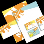
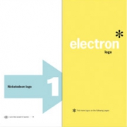
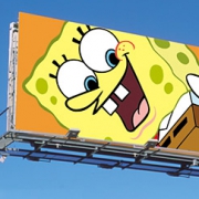
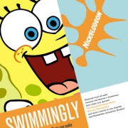
NickelodeonThe Nickelodeon brand had expanded and diversified over its fifteen-year history. Not atypically, the brand had not grown with a specific long-term overview, but had grown organically. While the successes of Nickelodeon had turned it into one of the leading children’s entertainment brands, it now faced danger of dilution as the various ventures moved further apart in message. AdamsMorioka interfaced with all components of the brand and returned with new brand architecture. This new structure allowed each venture to expand while being connected to the primary set of promises and message of the Nickelodeon brand. A reface of the on and off-air visual system followed, putting the findings and architecture into real time. The visuals were based on the idea of “kid modernism.” Opposing the standard visuals in children’s entertainment: complex layers, multiple typefaces, lots of purple and green, the Nickelodeon system approaches from the opposite side. The system is reductive; creating a focus on the brand and its product, characters like SpongeBob SquarePants and other properties. There are no extraneous shapes, colors or images. The message is simple, clear and direct. This is not about collage, but ideas and narrative. The system is utilized in all media, print, advertising, on-line and on-air. The on-air system takes the simplification of message further, by using still frames only. This provides a proprietary visual for Nickelodeon, separates the “voice of Nick” from the advertising, and slows the pace of children’s television down. Nickelodeon achieved its highest profit in its history the year following implementation of the system. |
||||
